K Health
K Therapy (formerly Trusst) is a remote therapy app focused on therapists specializing in online therapy and text-based therapy. I designed the app's visuals and user experience as the sole UI/UX designer. The app is available for iPhone and Android and is now a part of the K Health ecosystem.
2022 Notes
This case study was originally written in 2019 after I had completed the following design initiatives for the app. I began working at Trusst (as I will refer to the app in this case study) as a freelance designer and student keen on improving my skills as a designer. I continued to work as a designer for Trusst until early 2020. About a year after I stopped working for Trusst, the company was acquired by K Health and renamed K Therapy.
Now, the 2019 case study:
Time frame
March – May 2019
(3 mo)
Role
Lead Designer
Skills
User Research
Rapid Iteration
Wireframing
Prototyping
Figma
Sketch
Team
Mira Ram
Background
Trusst's initial mission was to create a more accessible and affordable form of therapy through a mobile app. I was immediately drawn to this mission, having personally struggled to find a good therapist on my university campus without having to wait weeks for an opening in their schedule. Through my own mental health struggles, I could easily empathize with Trusst’s target demographic.
My clients presented me with a rough user flow that they had already created in Sketch. Although the designs were rough, they hoped that I could build upon the existing material as they aimed to launch an MVP as soon as possible. Rather than focusing on an in-depth design process, the clients wanted me to prioritize improving the app's visuals before handing the designs over to their development team.
Initial User Research
Although my clients had only asked that I revamp the app's UI, I took it upon myself to conduct some research on the target demographic prior to creating new designs. In addition to asking my clients for more details on their market research, I also read through various articles on patient experience and remote therapy. From this research, I was able to generate a user journey map:
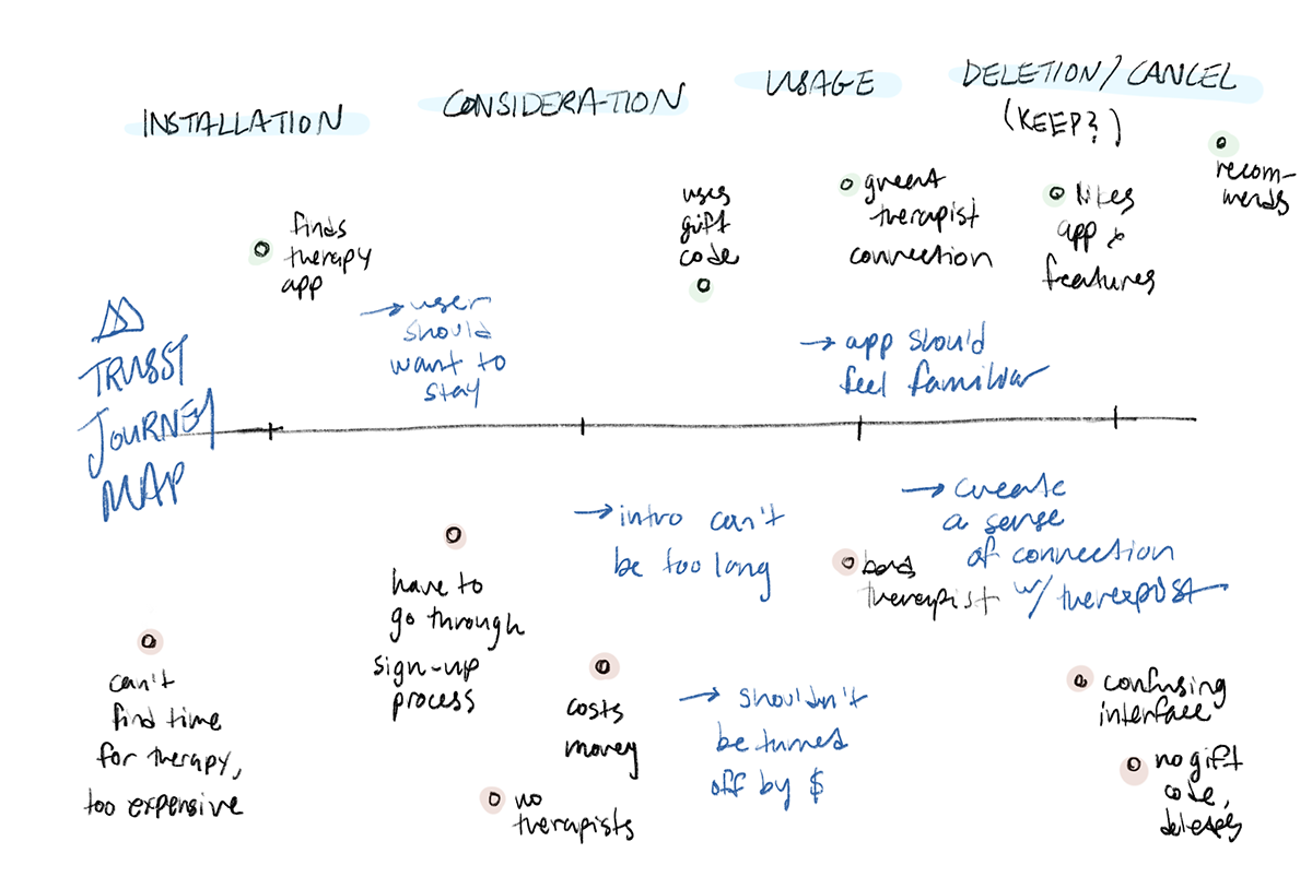
While this user journey encompasses the experience of a "typical patient," I made sure to further consider how age and disability might factor into the a user's experience with the app. Some user stories I considered include:
A university student needs easy and affordable access to therapy in order to improve their mental health enough to get through their school semester.
An office worker needs flexible therapy in order to find time for their mental wellness within their busy schedule.
A retired adult needs remote therapy in order to accomodate their unpredictable chronic conditions.
From my research, I was able to define three central goals for Trusst's redesign: accessibility, comfort, and retainment. With these goals in mind, I set out to create my first designs for the app.
THE GOAL
How might we create an accessible, comfortable, and safe space for therapy patients?
Forming an Easy-To-Use & Accessible Interface
The Sketch file the clients had provided me was a low-fidelity prototype mapping out the entire user flow for the app. While it was a good starting point, there was quite a bit of work to be done to improve the UI.
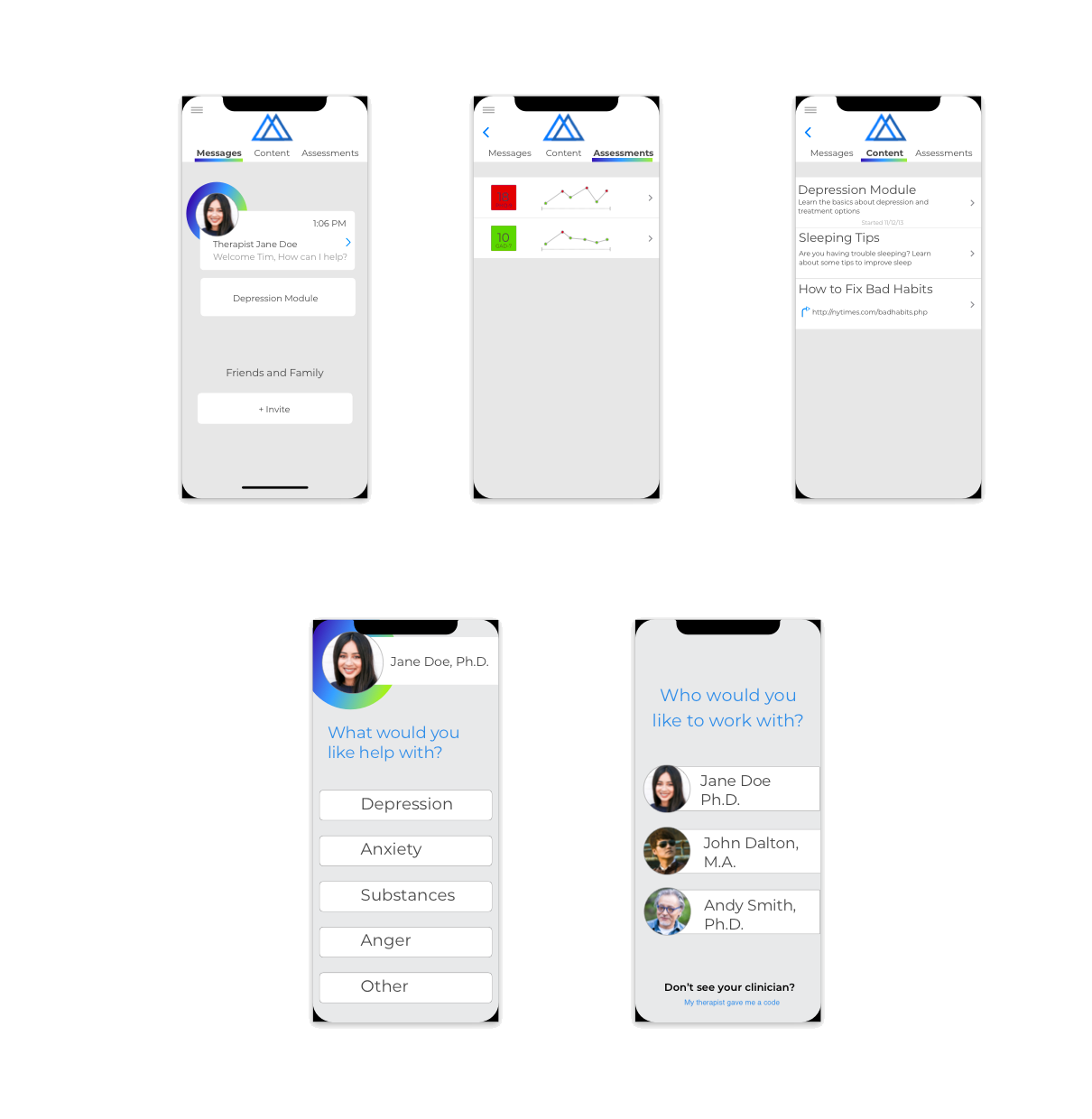
Initial screens provided by client; displays the core elements of the app, but lacks many of the details + sub-features the clients wanted for future versions
Keeping the clients' mockups in mind, I mapped out the app's key features and information architecture: Dashboard, Messages, Content, Assessments, Onboarding, and Therapist Introduction. I then sketched various ideas I had for the individual pages before moving onto more detailed wireframes.
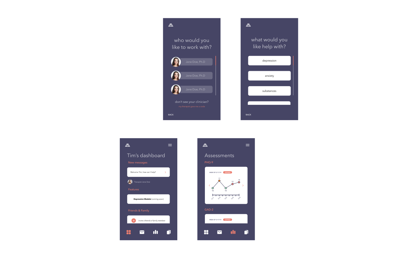
My first color mockups, featuring the initial therapist selection, help selection, dashboard, and assessments page.
When approaching the page layouts, I decided to keep a title on most pages in consideration of users who might utilize screen-readers as well as elderly users who might be less familiar with modern app conventions. Additionally, I aimed to create clear boundaries between sub-features on each screen for clarity. As I transitioned into creating higher-fidelity mockups, I chose colors with a high contrast ratio for easy reading.
Creating a Safe Space for Users
As I iterated on my designs, I kept in mind my second goal for patients to feel safe and comfortable while using the app. While I had originally used a coral color as an accent, I recognized that users could potentially associate a reddish color with anger, or in the case of Assessments (a section of the app where patients could view and take psychological assessments assigned by their provider), unfavorable results. After a few discussions with the clients, the background color was changed to a navy blue with a brighter blue used for the accents.
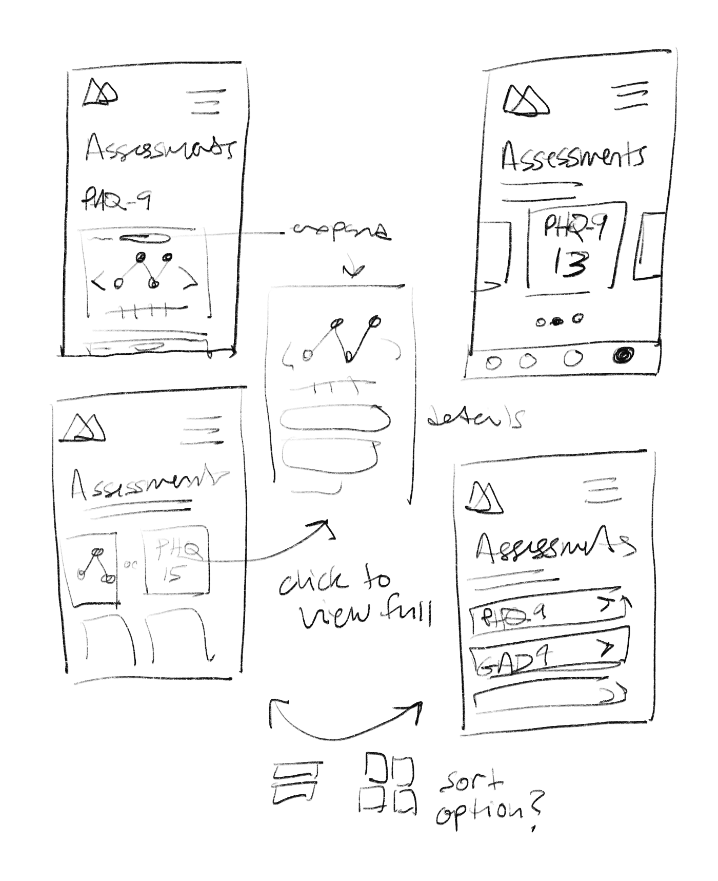
A few of my sketches of the Assessments page with different arrangements of features and options.
Throughout my design process, I came to notice a massive flaw in my designs for the assessment flow: I had been failing to build a connection between the patient and their therapist through the app. That is to say, I had been (literally) minimizing the most human part of the app. The clinician's face appeared in the icon too small to be able to make out their facial features, and that was in the only two screens they appeared in at all. I had forgotten the greatest strength of the client's initial prototype: the clinician stays with you every step of the way.
This effort to bring the human presence of the clinician back into the picture went hand-in-hand with my efforts to improve the Assessments page. Many of my previous attempts were based on the UX of the original prototype: the user would be able to view all of their trends on one scrolling page, while expanding out to view responses. However, this sort of view lacked one important component: privacy. This insight brought me to my decision to create a card style view of assessments, where a user's charts and results wouldn't be on full display to any passerby. Additionally, the clinician's portrait would appear at the beginning and end of the assessment, giving a typically less-than-pleasant examination process a more human touch.
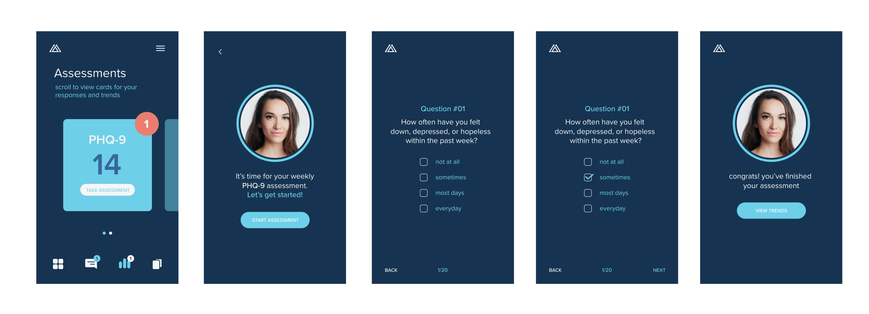
The Assessments page as it would appear in the second version of the app, featuring a card view and the clinician's portrait.
Making an App Patients Want to Use
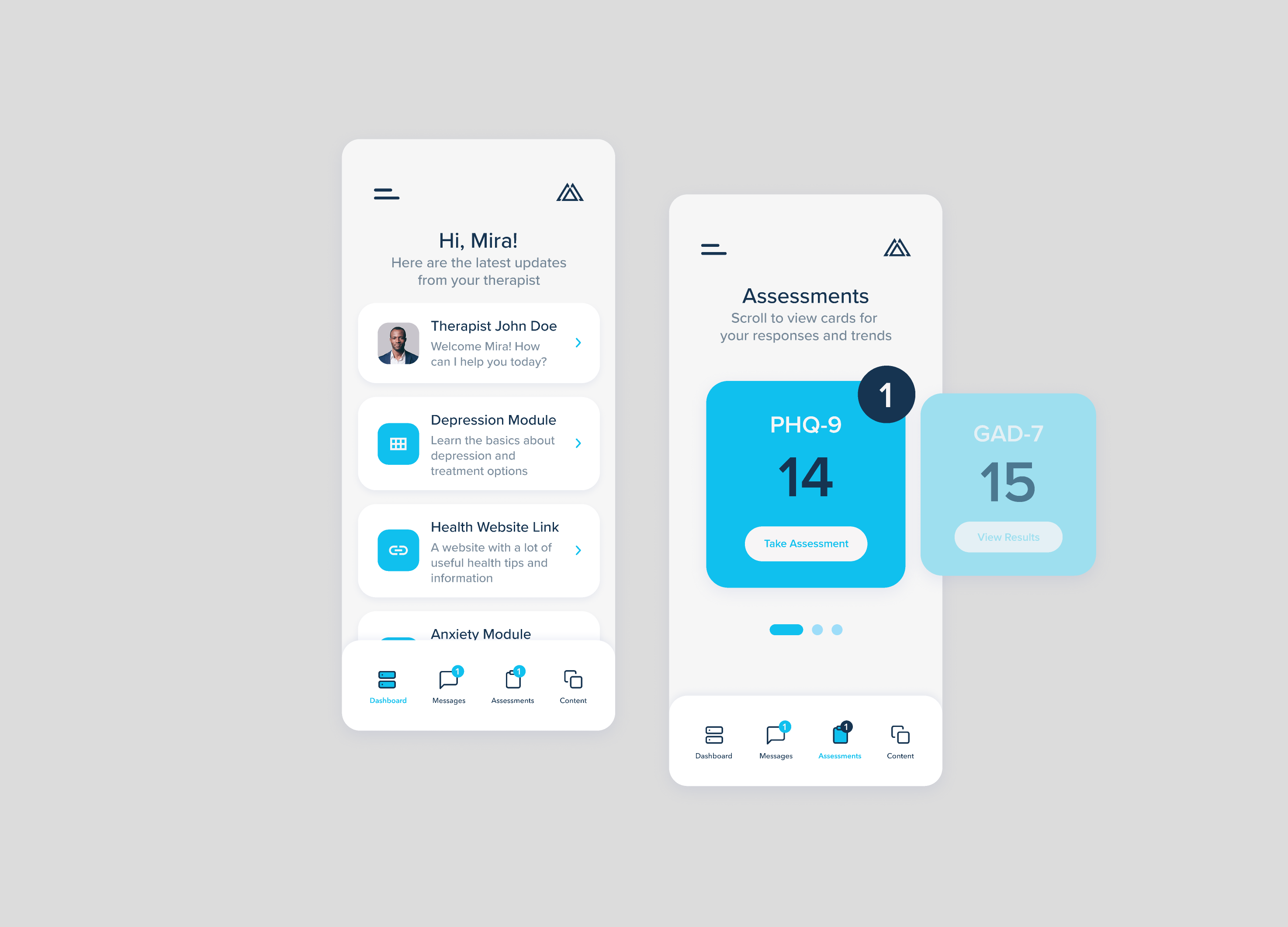
Some time after shipping my final designs for the second version of the app, I returned to my work with a fresh pair of eyes. At this point, the app was already in development and a beta version of the app was available for testing. Based on early tester feedback and my own experience using the app, I felt that there was still some friction with the current designs.
In revisiting my first two goals, I first addressed my goal to create an accessible interface. I made improvements to the app's legibility by adding labels to the navigation icons, adjusting the text and component sizes, and changing the app's color scheme. I also added clearer indicators for components that could be interacted with, and quick tutorials at times when an interaction might seem unclear to the user.
As for my second goal to make the app comfortable for users, I started by creating a more personalized dashboard with the user receiving a greeting ("Hi, [Name!]") at the top of the page. I additionally switched from a darker scheme to a lighter one for a more upbeat atmosphere (with an optional dark mode for users who prefer it). Finally, I included a few more modern design heuristics to create a greater sense of familiarity within the app (namely, moving the hamburger menu from the upper-right to the upper-left).
Final Product
As I wrote at the beginning of this case study, Trusst has since been acquired by K Health and is now known as K Therapy. While all of my original designs were implemented, the app has continued to grow and change since I concluded my work on this project.
Challenges & Takeaways
This project was one of the first freelance design projects I took on, notably as the sole designer. As I was still learning and growing as a designer, my skills steadily improved as I created designs for Trusst. The result of this growth was that I found myself constantly looking back at my previous designs and wanting to fix them. Through this project, I learned how to navigate the freelance world and started to build fundemental design skills.